Featured Article
Thornton Pinch-Hits for Kent State as President's Ambassador
Andre Thornton has brought his knowledge and leadership skills to Kent State University and has recently completed his first semester as the President's Ambassador.
read moreStudents Design New Devices to Improve People's Lives
Posted Jan. 24, 2011
Students in the Usability II class, taught by David Robins, Ph.D., an associate professor in the Information Architecture and Knowledge Management program in the School of Library and Information Science, tested how people interact with all sorts of devices, from car radios to phone applications. The goal of the testing was to examine how certain technologies can be improved and discover what new technologies could potentially meet users' needs. Students found participants, tested how they work with the devices, and designed new prototypes to satisfy the findings. Projects included testing and design for an automatic car wash, an improved photocopier design interface, a fast-food drive-thru prototype, a mobile phone "BeerFinder" application and a touch-screen car stereo.

One project's goal was to make a better car stereo.
Automatic Car Wash
Information Architecture and Knowledge Management students Aaron Hall and Gus Tsesmelis tested how people interact with car wash interfaces so they could create an improved design.
"The project was chosen after observing people taking inordinately long periods of time to complete a simple transaction at automated car wash booths," Hall and Tsesmelis say in their written report. "In one case, a potential customer left the car wash in frustration after repeated failed attempts to make a purchase."
The two students recruited a diverse group of participants and observed their interaction with two different car wash models. Participants ranged in age and gender, as well as experience level; some were familiar with automated car wash systems, while others had never used them before.
The test was done "with the help of real people with really dirty cars," Hall and Tsesmelis say.
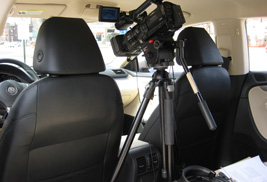
They performed in-car usability tests by having participants perform different tasks while the observer recorded the session.
The results of these tests were used to create a new design that would enhance the user experience.
"By designing an improved cashier interface, we expect that users would find the experience to be friendlier and less frustrating," Hall and Tsesmelis add.
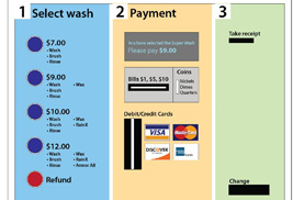
The redesigned system took the form of a paper prototype, which was used to create a physical prototype. The physical model was designed from realistic materials to provide an experience that closely simulates the real-life car wash scenario. The results: a newer, better system.
"Our analysis shows that all of the users tested on both systems preferred the prototype design over the existing car wash interfaces," Hall and Tsesmelis say.
The simplified design prototype included a clear step-by-step numbered process, the elimination of background graphics, and a car wash description next to each button. Those changes made it easier for users to move through the process and be sure of their purchases.
Not only would the new system lead to higher customer satisfaction and usage, but it should also cost less to produce, the students conclude.
Hall and Tsesmelis's efforts proved that "better, cost-effective and user-oriented solutions can be developed when thoughtful analysis and design principles are actively applied."
Improved Copier Interface
Jean Churchand Sheryl Dabney recognized the problems people seem to have with copiers, so they tested an existing model to create a better design.
"We tried to improve the traditional copier interface while maintaining the advanced features, then tested it for validity and usability," Church and Dabney explain in their report. .
The students developed a questionnaire for participants to determine their level of experience with copiers. Testing this diverse group gave them the insight needed to create a universal design for future use.
"The purpose of copiers is to make our lives easier," the students say, "but they usually add another level of frustration to our work lives."
Church and Dabney selected tasks that represented typical scenarios, from basic copying to using advanced features. The tasks also required participants to interact with all areas of the machine.
"We gained new insight into how people use copiers, how they think about creating copies, and how they approach using the advanced features that copiers offer," the team members say.
One company allowed the students to use their conference room as the testing site. Throughout the process, users made comments like, "That part is confusing to me" and "This format is so strange. Nothing like what I am used to."
With the new design, however, all participants were able to complete all the tasks quickly without intervention.
"Very clever interface!" said one user of the paper prototype. "I noticed it is not even plugged in."
Fast-Food Drive-Thru Interface
Christopher Hallahan, Elliott Hoffman and Ruwaida Salem designed a touch-screen drive-thru menu for a fast food restaurant. They noticed that customers sometimes have difficulty understanding or being understood by drive-thru employees.
Those difficulties are due to technological limitations of the speaker systems, as well as human errors, say Hallahan, Hoffman and Salem.
"To solve this problem, a prototype of an innovative drive-thru self-checkout system was developed as an alternative for customers to place their orders," the students say in their report.
The group identified college students as typical fast food consumers and recruited participants on campus. The diverse group of students included an even number of males and females, as well as one international student.
Hallahan, Hoffman and Salem created an example of their system using Axure.com. They gave participants laptop computers with the prototype on the screen, then explained how it would be used in real life.
Students completed a series of common tasks such as ordering a value meal, adding or removing items, and using different payment methods.
"These test tasks incorporated all the typical tasks that future users of the interface would perform," Hallahan, Hoffman and Salem say.
Participants thought the design was easy to use and learn. Some changes were recommended, so the designers revamped the interface. They recommended that the final version be tested one more time before putting it into production.
BeerFinder Mobile Device Application
Three students Cathy Carr, Holly Murphy and Matthew Pahls recognized the potential for profitability in unique mobile phone applications. The development of such applications has grown in recent years, and mobile devices now have the processing power and storage of some desktop computers.
"The applications are somewhat easy to create, and can be sold at a super low price or even free," Carr, Murphy and Pahls say. "That is why mobile device technology will keep growing at an exponential rate."
The students, therefore, decided to create their own phone application. With so many options out there, they had to come up with something new.
"This is where three minds decided to bring two things people love together: phones and beer," Carr, Murphy and Pahls say.
The team noticed that beer applications are already in existence, so they found a way to make one that is unique. They removed the focus from finding a bar, and put the focus instead on the beer that would eventually lead someone to the bar that serves it.
Carr, Murphy and Pahls had users select which categories of beer they wanted to see on the application. They used WebSort.net, software that allows researchers to input items to be categorized. While they hoped users would list broad categories of different kinds of beer, the participant-generated content was not quite what they expected.
Given little guidance for choosing a category, users suggested things like "beer my dad thinks I would like," "beer I've never heard of" and "Midwestern, hipster beer." The researchers determined the final categories, which included Ale, Indian Pale Ale and Pilsner.
Next, the team created a user interface closely resembling the actual application. Axure.com allowed them to use an iPhone template for the general layout. They quickly discovered that designing a mobile phone application is more difficult than designing a website due to the restricted screen size.
They tested participants independently and in the Information Architecture and Knowledge Management usability lab, utilizing eye-tracking equipment and audio-video recording.
"Right off the bat the team noticed that the interface had the ability to be really useful," Carr, Murphy and Pahls said.
Results
Students presented their projects and results in the Usability II class last spring. Robins encouraged students to go beyond traditional forms of technology.
"While websites and Web applications remain a strong focus of study in the user-experience design concentration in the Information Architecture Knowledge Management program, students are being encouraged to explore experiences people have with everyday objects in everyday life," Robins says.
Students came up with interesting ways to create and test their prototypes, Robins noticed. He also said that the groups ran into interesting and unexpected challenges.
Some of the tests did not go smoothly, results were not what the students were looking for and mistakes were made. This failure in the research and testing process led to the success of the final projects.
"You can learn a lot from having a bad time doing something," Robins says. "I hope you failed a lot," he joked.
By testing existing designs and learning what was wrong with them, students found new and innovative ways to improve the technology. Such findings even led to ideas for new devices that have not been created yet.
"One of the core philosophies of the user-experience design concentration in the Information Architecture and Knowledge Management program is that the world can be made a much better place to live if we can improve people's interactions with commonly used objects," Robins concludes.
By Dawn Burgasser